VOLVO CARS RETAILER SYSTEMS
KEY HIGHLIGHTS
-
Involved in strategic decision of key features
-
Led the experience design with different teams
-
In charge of the strategy and the execution of discovery initiatives
-
Worked with dev and stakeholders to implement the products
-
Point person in gathering analytics data regarding usage behavior
-
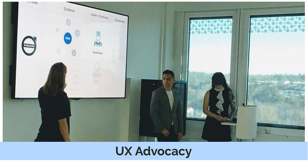
Created initiatives for UX advocacy (UX talks, newsletters, design team)
CASE STUDY: SYSTEM DASHBOARD
I handled three different platforms within Volvo Cars' service operations. One of which was the main system used by technicians to connect to the car during their repairs
Background
With our system having so many workflows and features to consider, my team was focused on helping technicians properly diagnose the fault in the vehicle in order to provide the appropriate remedy
The team
-
Product Owner
-
Business Analyst
-
UX Designer (Me)
-
Quality Assurance
-
3 Front end
-
2 Back end
-
1 Mobile dev
The purpose and goal of our team
Make continuous improvements to our fault tracing feature by improving the overall experience and workflow
Discovery
Given that there are so many things we can do in this area, we wanted to create focus. I did this by having a better understanding of our users and their workflows
User Interviews
Five in person interviews
Field observations
Internal Meetings
Discussions with management
Meeting subject experts
What did we learn?
One key insight that we got was that sometimes technicians (especially the newer ones) would diagnose the problem and often conclude that the car just needs a software update. Because different information is kept in different parts of the system, they would not see that there was something entirely different that was wrong with the car

In this user journey map example, we can see that Peter (generic name for persona) had a key pain point identified where it could have been avoided
Challenge
How might we improve the fault tracing workflow of our technicians so that they can identify the problem more efficiently and effectively?
Value Perspective
We get lots of feedback from internal experts on the field as well as actual users saying how difficult it is that key information is all over the place which could lead to challenges diagnosing the problem. Having a centralized view definitely will provide value to our users.
Feasibility Perspective
The task is definitely challenging but can be done. By phasing out the work, we can start with key information that we know is readily available and prepare for data points that are not yet established at a later point.
Usability Perspective
The challenge would be being able to visualize the data in a simple and meaningful way and be able to provide the user with the necessary information at certain points in time. Given that it can get cluttered with all the data points, the design needs to show only what is needed to avoid added cognitive load.
Viability Perspective
The company loses a lot of money whenever a customer needs to come back to the workshop because the technician wasn't able to diagnose the real problem. Any tool that can help them avoid this will definitely be valuable for the company.
Big Idea
Let's provide a general overview
Seeing how the system today has different key information scattered around where it gets easy to miss key data points, perhaps there is something we can do by providing a clearer general overview of the vehicle in order to give the technician a good place to start in their work

Early stages of the work
I discussed with subject matter experts on what kind of information do we think is important to be shown. This included stakeholders internally and some key representatives who can represent the technician persona

So we started brainstorming on how the information architecture should look like. I facilitated this work using an open card sorting exercise to see which key pieces of information were important
From there, I started sketching out some design concepts to test
Design concept
After a couple of back and forths with the team and key stakeholders, I landed on a design that we were confident to test out . NOTE: This design has been tweaked to show generic data points

Usability Testing
I designed a simple prototype using Figma to simulate typical scenario with some visits I would have some of our stakeholders there

Research Plan
Aside from the prototype, I needed to prepare other things for the research round:
-
Interview script
-
Task instructions that were printed out ( I would ask them to read the task out loud to limit my presence during the test)
-
Rainbow spreadsheet to see which key tasks were successfully done
-
Single ease questionnaire to serve as a metric I can quickly ask between tasks
Version 1
I did these tests in continuous cycles while improving the design every time until we were confident with what we have
I also would provide handouts to my team and the department on how the tests went via video recordings, PDFs, and showcasing them in our sprint demos

We learned a lot in our journey towards the first version. Being a big piece of work, the idea was to continue to build it in iterations as well as look out for feedback as we go along

I used a rainbow spreadsheet (left) to visualise task success and a single ease questionnaire (right) to measure task difficulty
What impact did this make?
We got a lot of feedback as we were building the first version. It seemed like this dashboard was setting up the foundation for more valuable features to be added on top of. This was also where I ended my journey with the company and left it in a state for others to build on
Other achievements at Volvo Cars


CASE STUDY: MOBILE APP
We focus on providing mobile-based solutions to further enhance workflows within the after sales area
Background
We had a small team focused on understanding the technician's workflow and seeing where mobile could be very valuable. Our approach was to take create mobile solutions for specific workflows and then slowly build more as we go along - ultimately to provide a "suite" of different apps for different workflows rather than just one big mobile app
Use case: Volvo on Call for sales
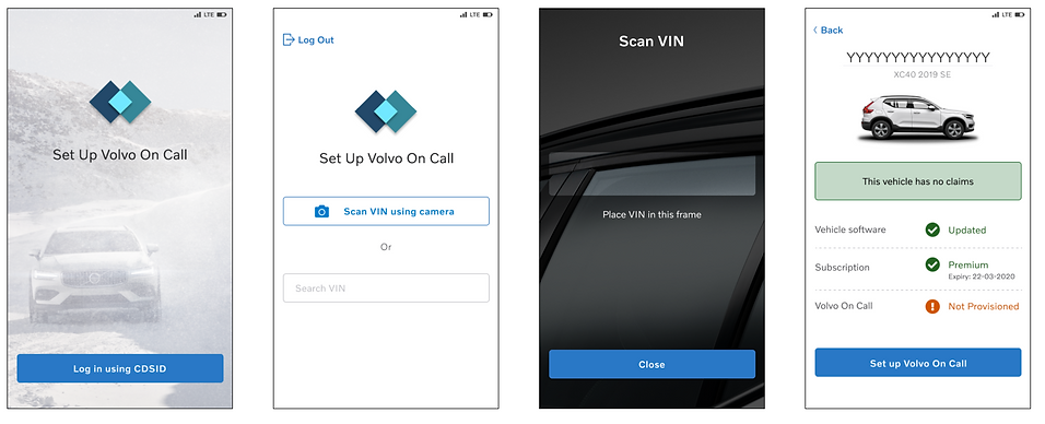
The focus of this case is on the salesperson persona specifically when they are about to release a new car to a customer and they need to set up Volvo on Call to the new car.
Some key challenges may arise
Vehicle software needs updating
Vehicle might need some key fixes
The process can be time consuming
Challenge
How might we provide our salespeople the right information at the proper time and place so that they can give the customer a smoother experience?
We created our first app to help improve this workflow. We also wanted a smaller scope since this was a new team with a completely new focus (we were desktop first before this)
Usability Testing
When I joined the team, we already had a working idea but we still needed to test this out with users. So the focus was more on testing out our solution rather than doing discovery from scratch
Research Plan
Aside from the prototype, I needed to prepare other things for the research round:
-
Interview script
-
Task instructions that were printed out ( I would ask them to read the task out loud to limit my presence during the test)
Some key highlights

"The VIN number, could we use the camera?"
- User
It was clear to us that scanning the vehicle number rather than manually inputting was more valuable. Even though there was a button to scan using the camera, this was not clear to our users

In order to make this button more findable we placed the button on top of the text field since normally, we read from top to bottom

“All sales persons probably don’t know exactly what that means”
- User
Considering the persona, our main user won't really know what to do when they see this information. Also, the next thing they should do is just to call their workshop

Although it usually helps to be specific when you give information, in this case, it was more important to highlight the key message which was to call their workshop. If they want to learn more, they could just tap the link to see what was this quality bulletin
What impact did this make?
The concept definitely had a lot of value to our users. Ultimately, we were able to make some refinements to the overall flow and did an initial release to selected markets which also gave positive feedback
Promising concept
The concept definitely had a lot of value to our users. We were also able to make some refinements to the overall flow from the feedback we got. As a mobile solution, it was a great step showing that we can scale the mobile capability to other key features
Pilot
We were able to try this solution out in selected markets to get some feedback. It was overall positive
Other screenshots
